The number 1
Foundation & Direction
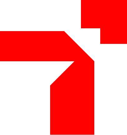
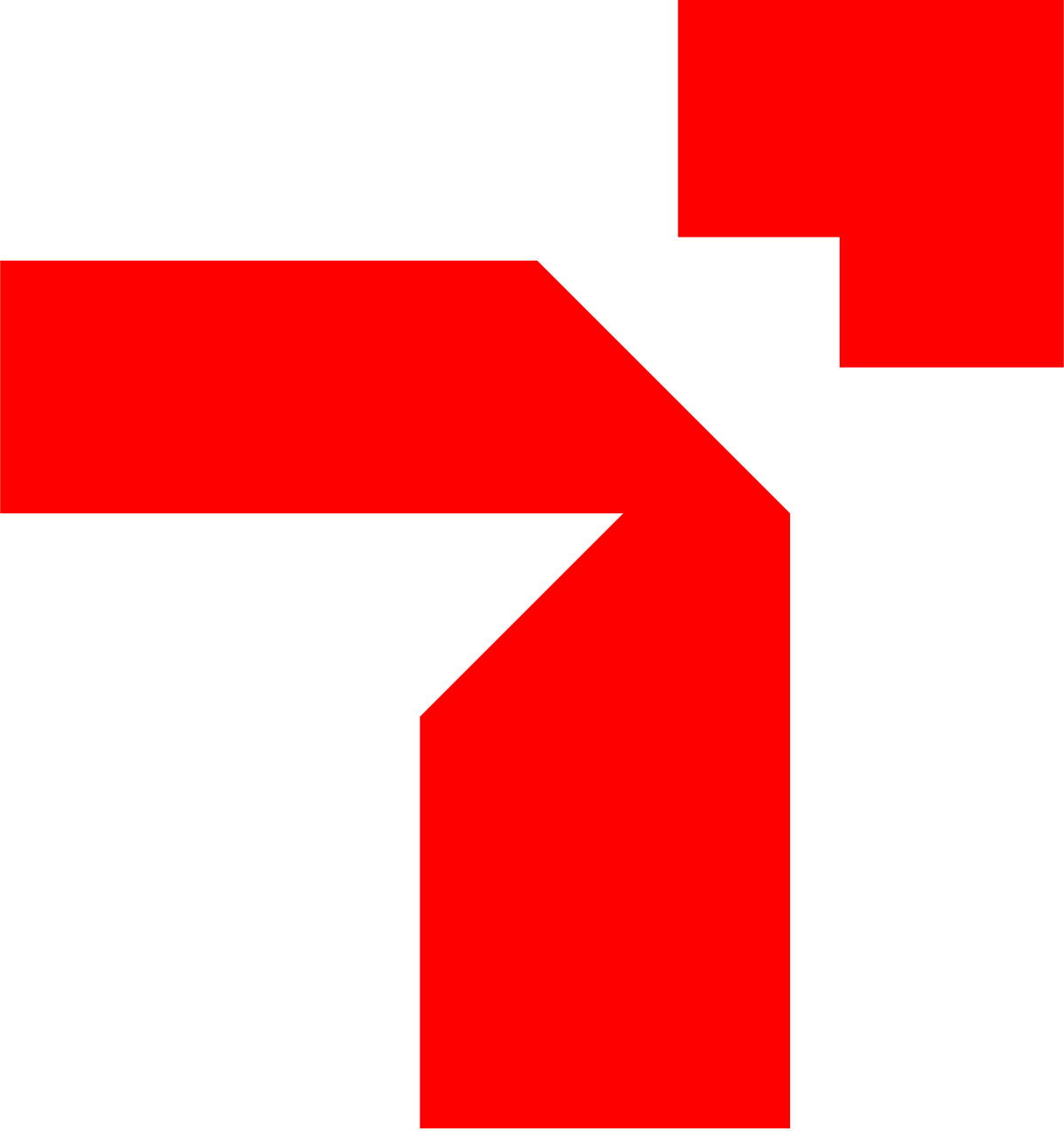
The main form represents the number 1. It symbolises leadership, a strong foundation, direction, progress and the courage to move forward.
- Leadership
- Foundation
- Direction
- Initiative
- Forward movement
Brand identity
A brand growth and production company, turning ideas into creative experiences, shaping cultures and designing greater possibilities for generations to come.
The meaning of 18
Eighteen Studio exists to turn ideas into creative experiences that shape cultures, design solutions and inspire generations.
The number 1
The main form represents the number 1. It symbolises leadership, a strong foundation, direction, progress and the courage to move forward.
The number 8
The top right form represents the number 8 in a simplified, abstract way. It symbolises growth, continuity, balance, completeness and greater possibilities.
The number 18
When the 1 and 8 come together, they create 18: ideas that move from foundation into growth. It speaks of vision, execution, expansion and lasting impact.
01
Creativity
Bold ideas, timeless design.
02
Impact
Solutions that matter.
03
Excellence
Global standards, local relevance.
04
People
Inspiring generations.
05
Future
Shaping cultures, shaping the future.
Logo
Use the full logo wherever there is room, and the mark alone for app icons, favicons and social avatars. Download SVG for design and print, PNG for everyday use.
Keep clear space around the logo equal to the height of the small square in the mark. Never use the full logo smaller than 25 mm in print or 100 px on screen; below that, use the mark on its own.
Colour
Tap any colour to copy its HEX code.
Eighteen Red
Energy, creativity, passion, movement and bold ideas.
Black
Strength, clarity, professionalism and focus.
White
Simplicity, clarity, openness and possibilities.
Dark Gray
Backgrounds, text and neutral elements.
Medium Gray
Secondary text, borders and dividers.
Light Gray
Backgrounds and subtle elements.
Red Tint
Highlights, badges and soft backgrounds.
Typography
Primary typeface
Manrope
Aa Bb Cc Dd Ee Ff Gg Hh Ii Jj Kk Ll Mm Nn Oo Pp Qq Rr Ss Tt Uu Vv Ww Xx Yy Zz 0123456789
Light · Regular · Medium · Semibold · Bold · Extrabold
Secondary typeface
Inter
Aa Bb Cc Dd Ee Ff Gg Hh Ii Jj Kk Ll Mm Nn Oo Pp Qq Rr Ss Tt Uu Vv Ww Xx Yy Zz 0123456789
Regular · Medium · Semibold · Bold
Creative Solutions for a Greater Tomorrow.
Manrope Extrabold · 48 to 72 pt
Ideas that move forward.
Manrope Bold · 32 to 40 pt
Design. Print. Publish. Build.
Manrope Semibold · 24 to 28 pt
We create solutions that inspire generations and shape the future.
Inter Regular · 14 to 16 pt
Eighteen Studio
Inter Regular / Medium · 12 to 14 pt
Guidelines
Every guideline board, grouped by chapter. Tap a board to open it full size.
Downloads
Every logo version in SVG and PNG, plus the colour codes and type specification.